10 juil. 2011

Nicolas Turki Duchesnay- Mountains (Final prototype)/Montagnes (Prototype final)

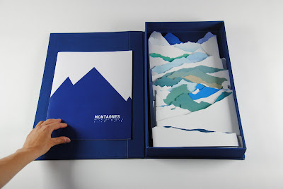
For this Workshop with Mr Komagata, I chose to work on a book for partially sighted people. My goal was to create a book designed for children but also for adult. A simple book to start learning things on a subject like pictures book we red in our childhood. Instead of creating a pictures book, I thought this book has to be more like a game to engage other sense like touch and to lead up people put  the shapes in the space.

I finally chose to work on mountains, because they are imposing, they are relaxing for the sight, they stand out in simple shapes against the sky. First, people distinguish their blurry shapes in the distance then they become clearer. Moreover, a physical link exists between people and the mountains : travelling in such landscape involved many senses as smell, sight, touch, hearing…
These are the feelings, that I intended to  relate by this book.

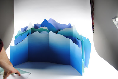
I focused on the world's 18 biggest peaks, and chose to class them from the biggest to the smallest. I did large gradations by silkscreening and cut the shapes of these mountains out the gradations with care to respect the proportions of there height. The biggest is 1meter length by 50 cm height and the smallest, 1m length by 5,7cm height.

All along my researches I decided to transform this book into a box containing all the mountains and a booklet.  All the mountains are classed from the biggest (EVEREST) to the smallest (VESUVE) in the booklet and come along with a few information. This way, the reader has to find which shapes goes with which mountains.

The final version of the project is a box (dimensions 30x51cm) containing all the mountains and the booklet. My goal is to make the reader learn a few things about the world surrounding him.




1 juil. 2011

Emmanuelle Bastien- Le nouveau, une histoire à lire du bout des doigts / A New Boy, a story to read with the fingertips


A tactile story made with thread and paper
I favoured the technique of embossing where the differences of textures, that make recognition easier for blind people, come from embossed materials and not from papers types. Although less attractive for sighted persons (the book seems all white) each page invites to experience of touch, without any visual stimulation. The text, printed on a flap at the end of the book, provides access to the story without disturbing tactile reading. I wanted the pages to be like a small theater where the protagonists come on stage and meet. 
Conceive a book for this specific public, requires to consider new criteria because their perception of real is, obviously, different. In the case of this book, the difficulty was in the expression of feelings with a minimum of means. Working with Katsumi Komagata allowed me to simplify and get to the point. The tactile dimension opens up news ways, maybe another adventure for illustrators?

Avec de la ficelle et du papier est née une histoire tactile 
J’ai privilégié la technique du gaufrage où les différences de textures, indices de reconnaissance pour les personnes en césités, sont directement issues des matériaux gaufrés et non des types de papiers. 
Bien que peu attractif pour des voyants (le livre semble tout blanc), chaque page invite à faire l’expérience du touché, sans autre stimulation visuelle. Le texte, imprimé en noir sur un rabat en fin d’ouvrage, permet l’accès à l’histoire pour les voyants sans en perturber sa lecture tactile.
Je voulais que l’espace de la page soit comme un petit théâtre où les protagonistes entrent en scène et se rencontrent.
Penser un livre pour des personnes déficientes visuelles demande de prendre en compte de nouveaux critères car la manière d'appréhender le réel est autre. Dans ce cas précis, toute la difficulté résidait dans l’expression de sentiments avec un minimum de moyens. Le travail avec Katsumi Komagata m’a permis de simplifier et d’aller à l’essentiel. La dimension tactile ouvre de nouvelles pistes, peut-être un autre terrain d’aventure pour les illustrateurs ?

20 juin 2011

Marc Socié- "Show me your colors" (Final prototype) / "Montre-moi tes couleurs" (Maquette finale)


1) Here is the final version of my book project for color blind people titled "Show me your colors". I decided to make it a small size object (dimensions 20x14) so It can create a personal relationship with the reader.

The principle is still the same and is quite simple : left page is dedicated to my vision as a color blind person, and the right page to the regular one. I chose to use animals as simple examples to illustate this idea so that everybody, no matter age or culture, can relate to it.  The elements stand face to face with a mirror-like layout, so a dialogue can be created between the two visions.

With this project, I want to show that there's not one unique perception of our world, even among the color blind people, and that something that can be considered as a disability can be a source of creativity. I'm really determined to complete this book as I think it can really become something usefull, questionning my own vision and others'.

2) Voici la version finale de mon projet de livre pour daltonien intitulé "Montre-moi tes couleurs". J'ai décidé d'opter pour un petit format (dimensions 20x14cm) afin qu'un rapport plus intimiste puisse se créer avec le lecteur.

Le principe est resté le même et est assez simple : la page de gauche est dédiée à ma propre vision en tant que daltonien, et la page de droite à la vision dite normale. J'ai choisi de représenter des animaux faisant office d'exemples puisque ce sont des formes qui parlent à tous, peu importe l'âge ou la culture. Les éléments se font face à la façon d'un miroir et un dialogue peut alors se créer entre les deux visions.

Avec ce projet, Je veux montrer qu'il n'existe pas qu'une seule et unique perception de notre monde, même parmi les daltoniens, et que quelque chose qui peut être considérée comme un handicap peut en fait devenir une source de créativité. Je suis vraiment déterminé à compléter ce livre car je pense qu'il peut devenir quelque chose d'utile, arrivant à questionner ma propre vision et celle des autres.

 
1) Introduction page with the color blindness definition.

2) Page de présentation avec la définition du daltonisme.

1) Explanatory page of the book's "mirror" principle.

2) Page d'explication du principe de mise en page "miroir" du livre.


1) Last page.

2) Dernière page.

26 mai 2011

mathieu- expérimentation

 Voici quelques expérimentations que j'ai réalisé dans le cadre de mon sujet qui était d'expliquer et de faire comprendre des notions d'espaces théoriques simples à des non voyants.

these are some experimentation that i did for my subject which was : explain and help understanding some simples notions of space  to blind peoples.


28 avr. 2011

Marc Socié- "What does your world look like ?" (Final concept) / "A quoi ressemble ton monde ?" (Idée Finale)


1) After talking with Mr. Komagata, It appeared clearly that my first concept "Which colour for this animal ?" was too strict and didn't let the reader make his own experience, color blind or not.

Understanding this state of fact, I decided to do something more personal about my own perception, and not only for children but for all color blind people and the the ones wanting to understand them.
I'm currently working on a book showing color blind's vision of our world and making it easy to understand for everybody, showing colorblindness not as a default but as something positive.

Left page is dedicated to my vision, color blind, and the right page is for the regular one that is made by other people who help me on this project. By facing those two visions on a double page in this book with also personal writing, a dialogue can be created and surprises can occur.

2) Après avoir parlé avec Mr Komagata, il est apparu clairement que la proposition "Quelle couleur pour cet animal ?" ne laissait pas assez de liberté au lecteur, peu importe sa perception.

En suivant cette remarque, je me suis orienté sur quelque chose de plus personnel basé sur ma propre vision du monde et qui ne soit pas adressé spécifiquement aux enfants mais à tous les daltoniens en général et ceux voulant les comprendre. Je travaille actuellement sur un livre voulant montrer la vision qu'ont les daltoniens du monde aux autres et cela comme quelque chose de positif et non comme un défaut.

La page de gauche est dédiée à ma perception et la page de droite à celle dite normale sur laquelle je fais participer d'autres personnes. En mettant face à face ces deux visions sur une double page avec une écriture personnelle, le dialogue peut se créer et laisser place à des surprises.

 1) Comparison of color blind's eye and regular one with a colour game.

2) Comparaison oeil daltonien / oeil normal avec un jeu de remplissage de couleurs.

1) Face to face of fawn's colours

2) Face à face des deux teintes du faon

1) Sun's brightness differences

2) Les différences de luminosité du soleil

1) Flamingos fake-twins version

2) Les flamants roses faux-jumeaux


* This is a prototype, not the final result.
* Il s'agit d'une maquette du livre et non sa version finale.

Marc Socié- "Which colour for this animal ?" (First concept) / "Quelle couleur pour cet animal ?" (Première démarche)


1) My first idea was to work on color blind children's eye education, helping them understanding both the way they see the world and other people's perception.

2) Ma première idée était de travailler sur l'éducation visuelle des enfants atteints de daltonisme, en les aidant à comprendre à la fois la façon dont ils perçoivent le monde qui les entoure ainsi que celle des autres.


1) The principle was a simple game based on colours discovery applied to animals, the goal would be to find which colour would match with a precise shape. There would be tricks for color blind people on the way.
With tactile hints but also with the text itself, the child would be helped finding the answer corresponding to reality, but before that he would have to encounter tricky colours tons that could fool or lose him.
eg : Grey mouse can be seen pink by color blind people or light-brown horse can, among other examples, be perceived green. 

2) Le principe était celui d'un simple jeu de découverte de la couleur d'un animal, à savoir trouver quelle teinte correspond à une forme précise avec des pièges pour les daltoniens.
Grâce à des indices aussi bien tactiles que purement textuels, l'enfant serait guidé vers la réponse la plus proche de la réalité mais avec, avant cela, des teintes pouvant le dérouter ou le tromper.
ex : La souris grise qui est proche du rose pour les daltoniens ou encore la robe brun clair du cheval qui peut être confondue entre autre avec le vert.

23 avr. 2011

Great atmosphere

I had extremely good time with all of you, and the results came out really interesting and efficient for blind people. I also like the atmosphere very much that the teachers are backing up everyone to achieve the projects. I will have the conferences a couple times here in Japan in August with the subject "TACTILE" at the Museums, and they are Setagaya Museum, Yokosuka Museum, and Children castle. I would like to introduce our projects for sure. Thank you all and please finish the projects so that I will try to set up the exhibit with your works here in Tokyo. You deserve it.